Village of Flossmoor, Illinois
Beautiful. Welcoming. Connected.
Once upon a time Flossmoor was a summer destination for affluent Chicagoans attracted to the beautiful country clubs, golf courses, and graceful homes. Today the Village of Flossmoor continues to be a safe community with excellent housing stock, good housing values, and great schools. It’s also an extremely supportive, progressive, and committed community that thrives on diversity of all kinds. Our challenge was to overcome misperceptions of the South Suburbs and develop positioning, key messaging, identity, and overall visual brand approach that clearly communicates Flossmoor’s unique strengths, represents a source of pride for existing residents and businesses, and is the basis for new resident and business prospect marketing communications.
Our research helped us to identify three differentiating attributes for Flossmoor—1) Open-minded/inclusive, 2) Classically American/beautiful, and 3) Culturally connected/intelligent (easy access to Chicago, vibrant, educated community).
Extending these attributes to Flossmoor brand messaging and visuals meant they must feel open, clear, and friendly, with an element of historic charm—though still contemporary, fresh, and connected to now.
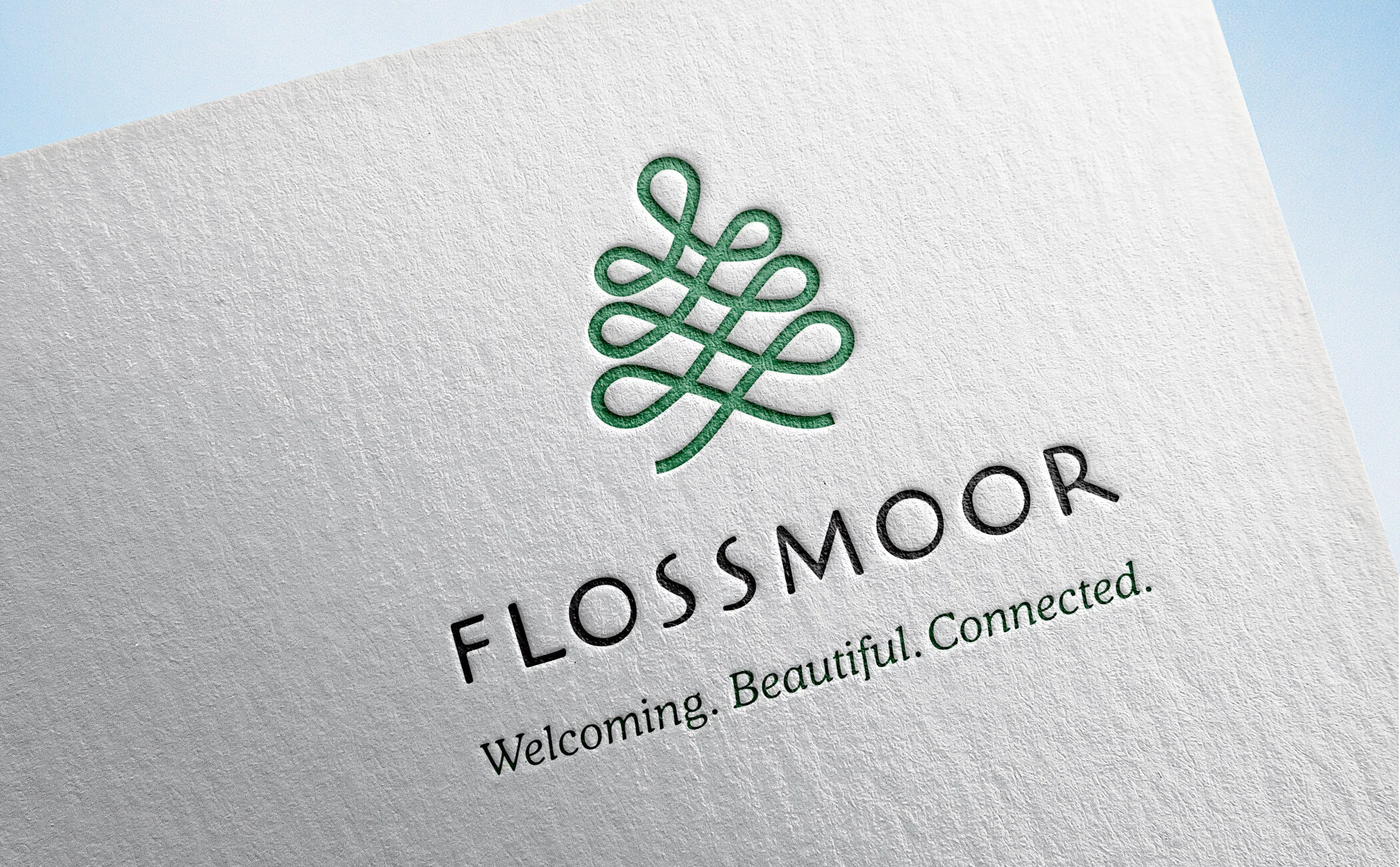
The new brand symbolizes the heart and soul of Flossmoor—a small town steeped in beauty and history and energized by diversity and inclusiveness in all its forms.
The tree shape, drawn with an unbroken line, reflects Flossmoor’s natural and architectural beauty, and the strong connections between neighbors and with the city of Chicago.
The line weaves itself into branches and leaves—the parents and children of all descriptions who make Flossmoor such a vibrant and special place to live.
The line begins and ends at the root of the tree, in Flossmoor. Because no matter where your day or your life takes you, it feels good to come back to where you belong.
Client Success
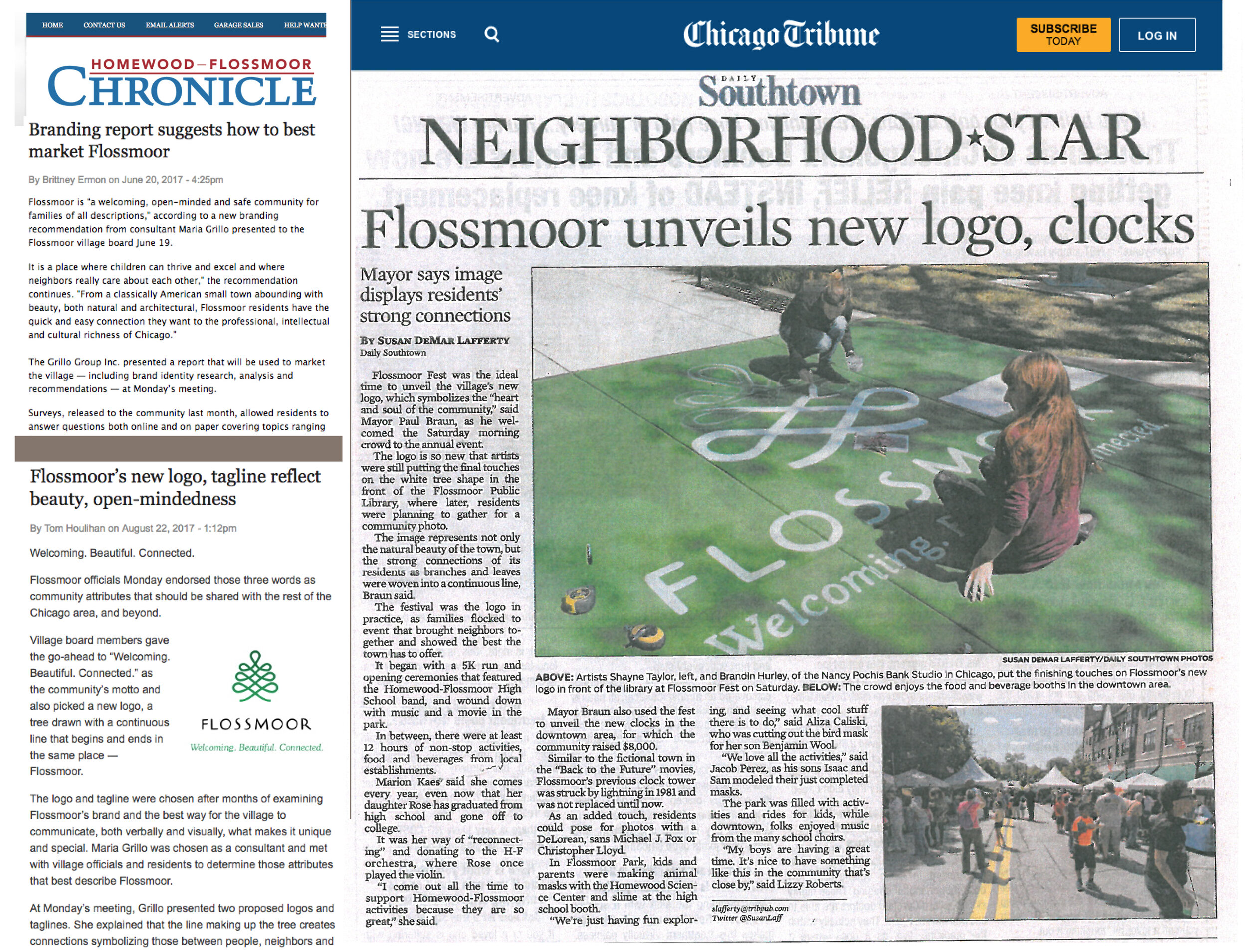
The identity launch at Flossmoor’s annual FlossmoorFest was met with universal enthusiasm and support. People were visibly moved when the Mayor presented the meaning behind the new brand identity.


